
Designing to save employees time –
Room Finder Application.
General Motors
My Role:
Lead designer
Researcher
Interaction design
Visual design
Prototype
Platform:
iOS
Android
Project Overview
As part of GM IT’s annual innovation challenge—focused on saving employees 5 minutes per day—I led the design of Room Finder, a mobile tool to help employees navigate GM’s vast campuses and locate meeting rooms more efficiently.
Problem
GM’s four U.S. innovation centers (Michigan, Atlanta, Arizona, Austin) each house over 2,000 employees and more than 100 meeting rooms. Employees often struggled to find rooms due to complex layouts, inconsistent signage, and unclear room numbering, leading to late arrivals and lost productivity.
Opportunity
How can we reduce the daily amount of time employees spend looking for meeting rooms?
gOALS
Reduce time spent locating meeting rooms.
Enhance the overall employee experience.
Phase 1: Research & Discovery
Interviews: Conducted with 20 employees across all campuses, revealing universal challenges in room navigation.
Observations: Participants took up to three times longer to find unfamiliar rooms, especially on higher floors.
Insights: Employees desired features like visual directions, the ability to save frequently visited rooms, and personalization options.
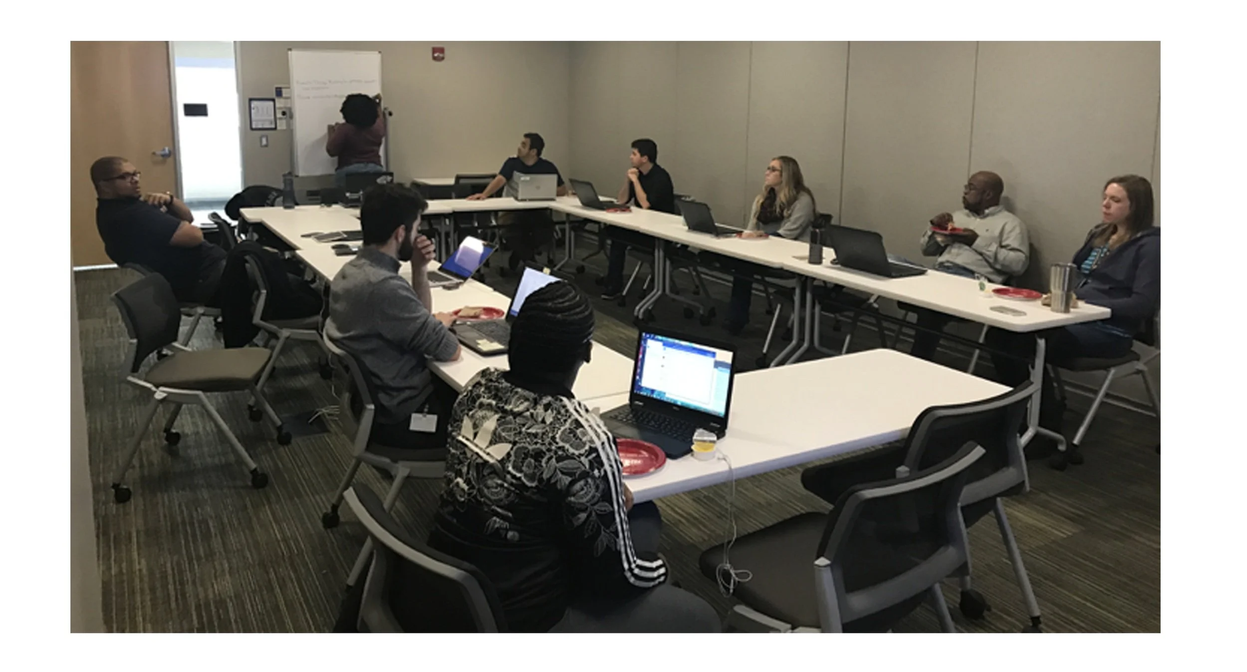
Atlanta team in a meeting sharing research findings.
Phase 2: Ideation & Technical Alignment
Collaborated with engineering to explore solutions:
Static Maps: Considered preloading building maps for room searches.
GPS Integration: Determined feasible for tracking user location within buildings, enhancing wayfinding without full turn-by-turn navigation.
Phase 3: Design Solutions
Key Features:
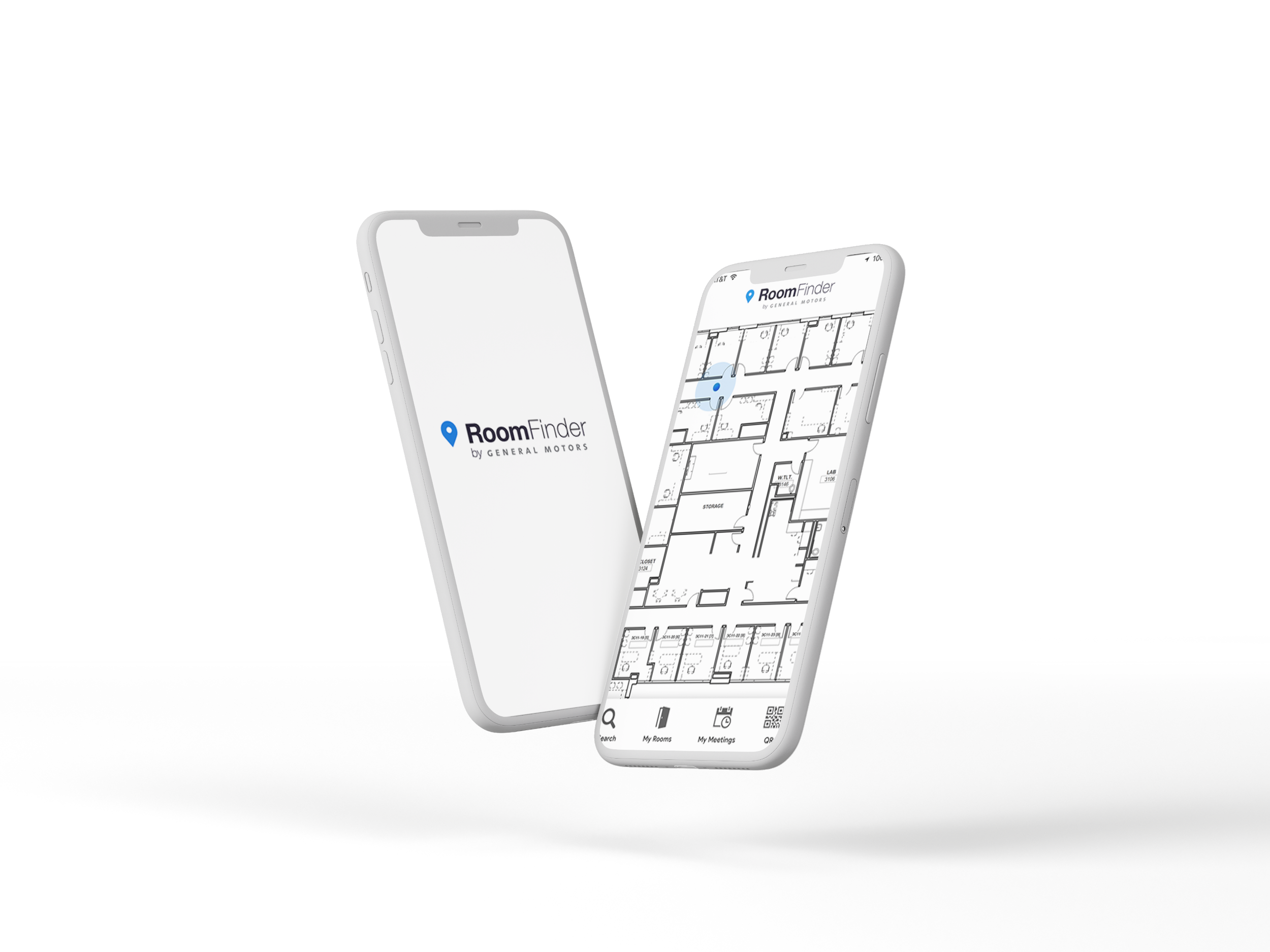
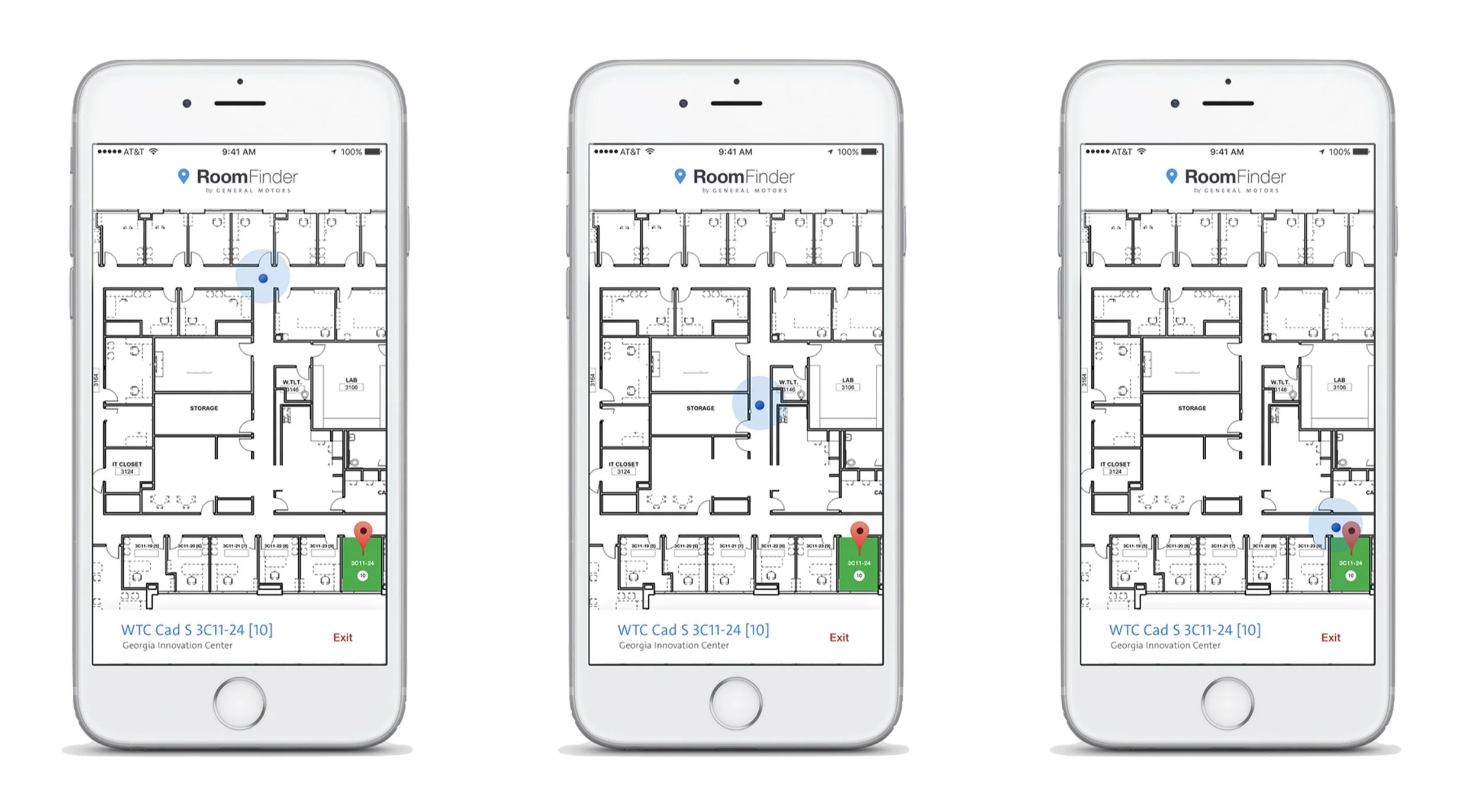
GPS-Based Navigation: Automatically detects user location and campus, providing real-time directions to the desired room.
Room Details: Displays room number, floor, and building information prominently.
User Personalization: Allows users to save frequently visited rooms and assign custom names or notes.
Brand Integration: Incorporated GM branding for a cohesive internal tool experience.
Visual Design Highlights
Intuitive User Interface:
Minimalistic design with bold headings to guide users through navigation steps.
Leveraging GPS, the app acted as an internal navigation tool. It automatically detected the user's location and identified which campus they were on. After entering a room number, the app provided real-time directions from their current location to the room.
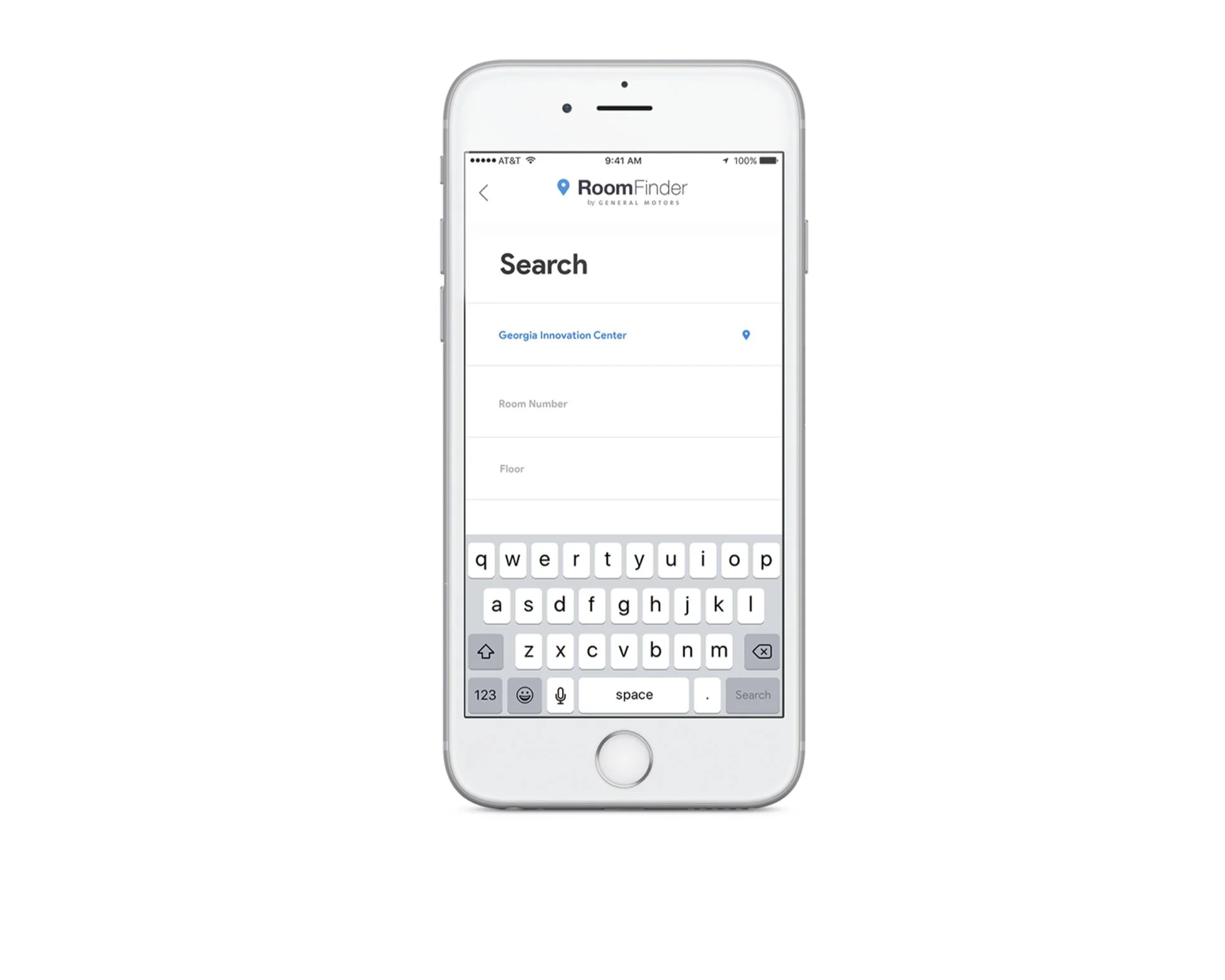
1. I incorporated the company logo and branding throughout the design, aligning with the internal nature of the tool.
2. Bold headings at the top of each page indicated the user’s progress in the navigation process.
3. To avoid mistakes, the app displayed the building being searched first, ensuring the user knew exactly where they were.
4. Room details, including the room number and floor, followed next.
5. The user interface was designed to be straightforward and minimalistic, focusing only on essential elements for seamless navigation.
Error Prevention:
Clear display of current building and room details to minimize confusion.
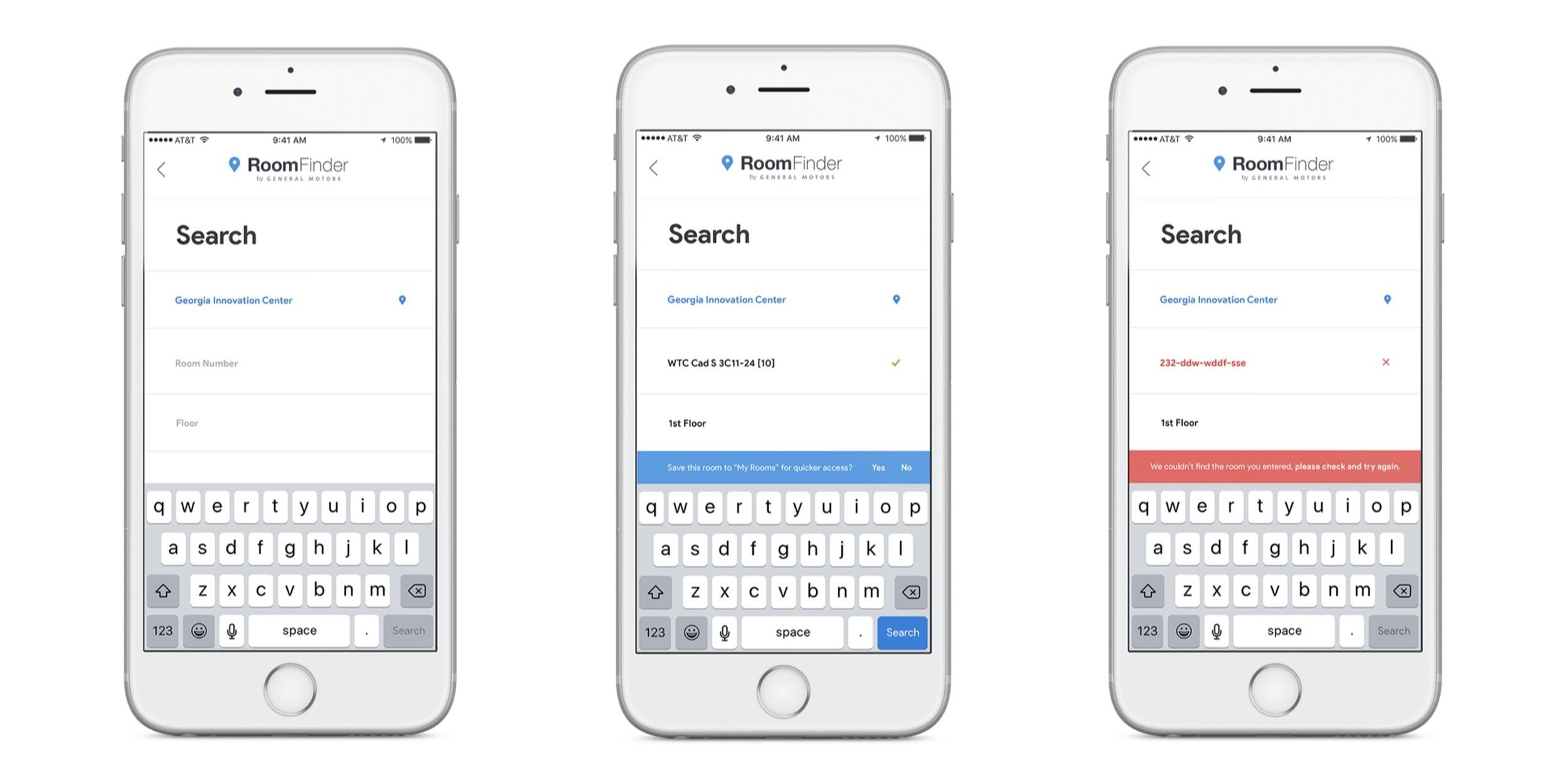
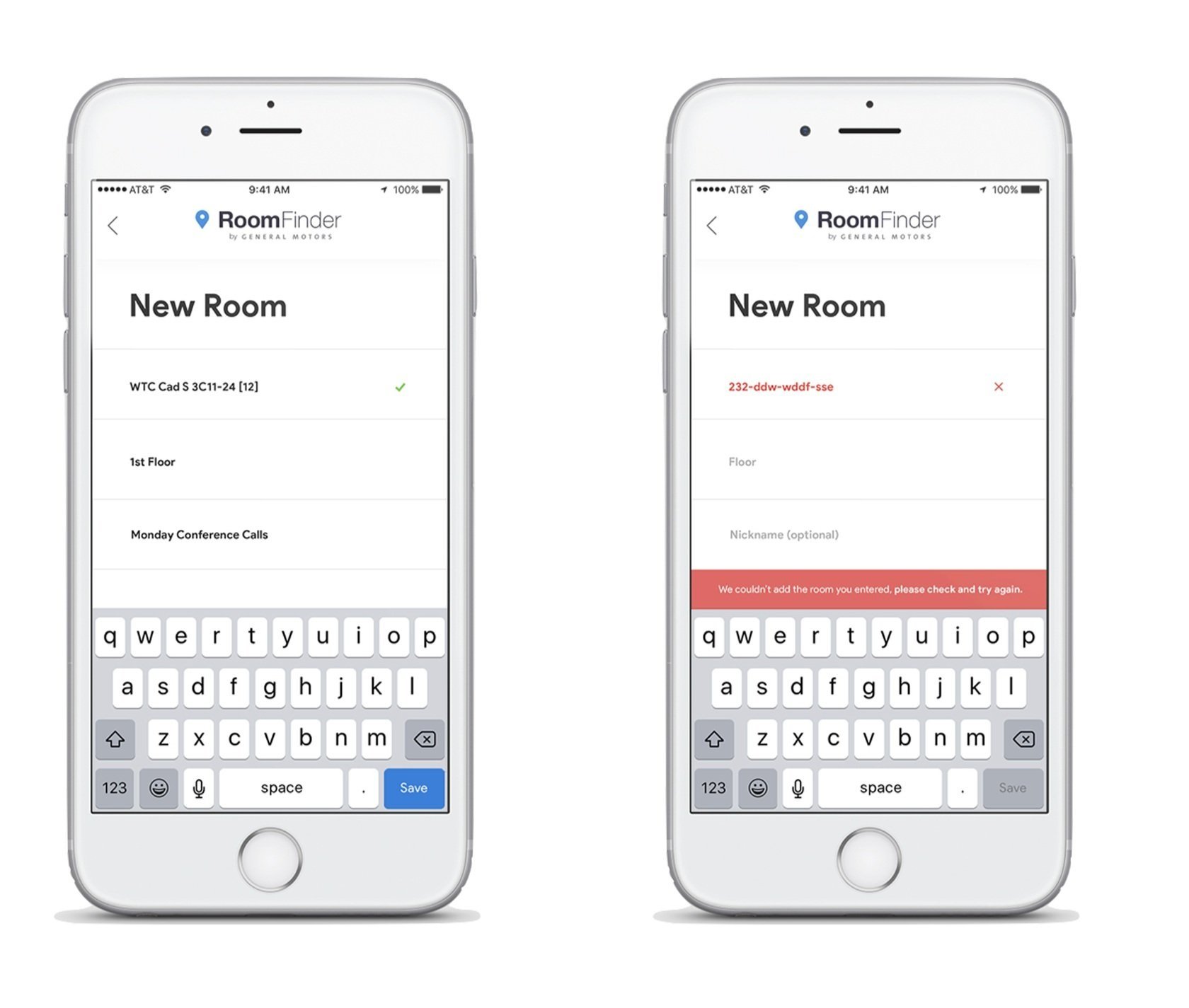
Anticipating that employees might enter incomplete room numbers, I used color as a simple yet effective way to differentiate and communicate between complete and incomplete entries.
Progress Indicators:
Visual cues to show users their current position and destination within the building.
Understanding that the majority of employees in the innovation centers were IT developers who used Android devices, I took inspiration from Google Maps themes to integrate into our application. The goal was to provide a familiar platform experience based on apps they already used in their daily lives.
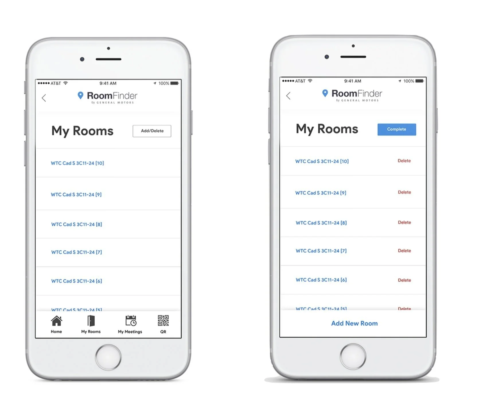
Room Management
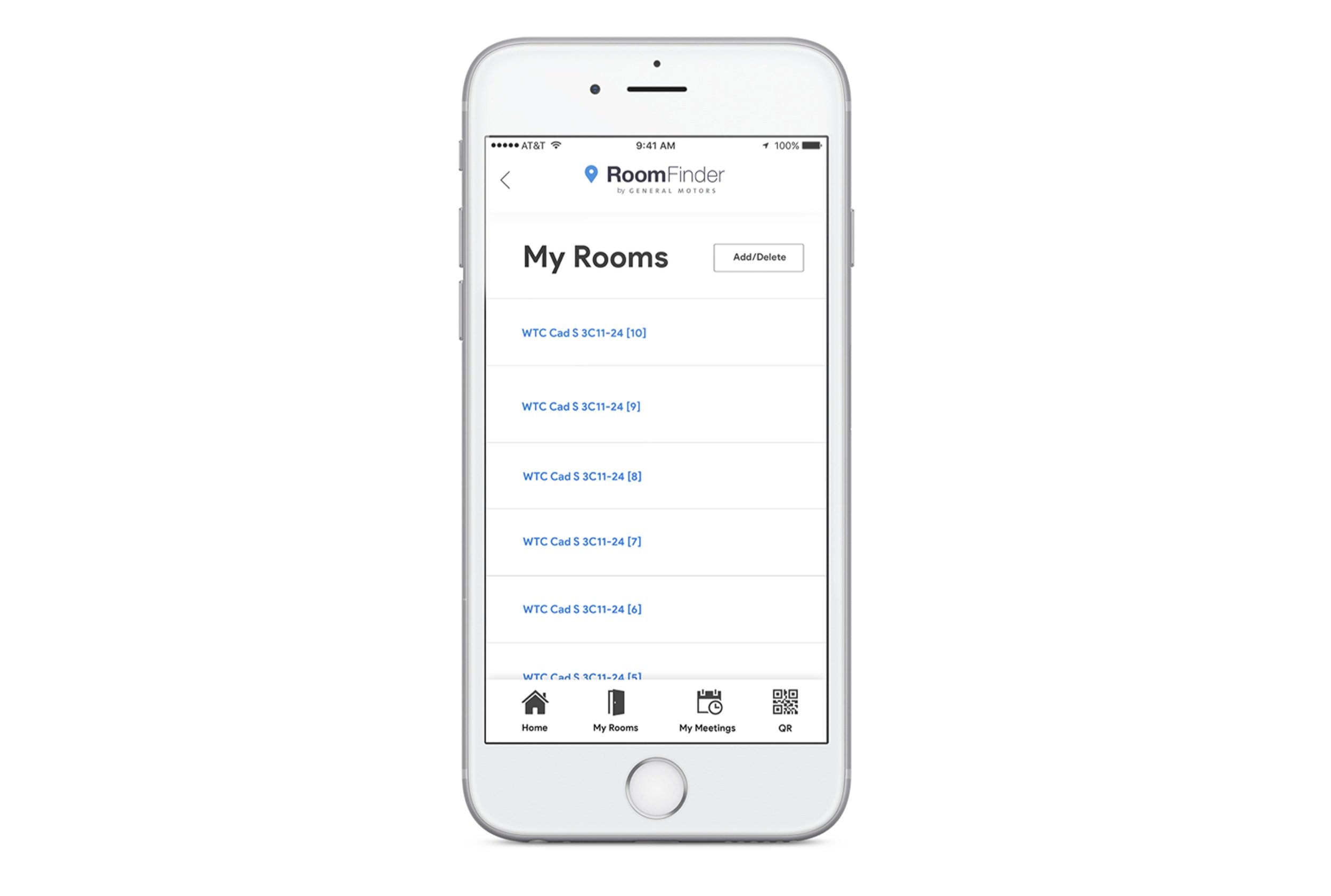
Anticipating frequent revisits to certain rooms, I incorporated a workflow to allow users to save room details for easier future access. “My Rooms," allowed users to view a list of their frequently visited rooms, adding a personalized touch to the experience. The design of this page remained minimalistic, allowing users to add or delete a room through simple actions.
Room Personalization
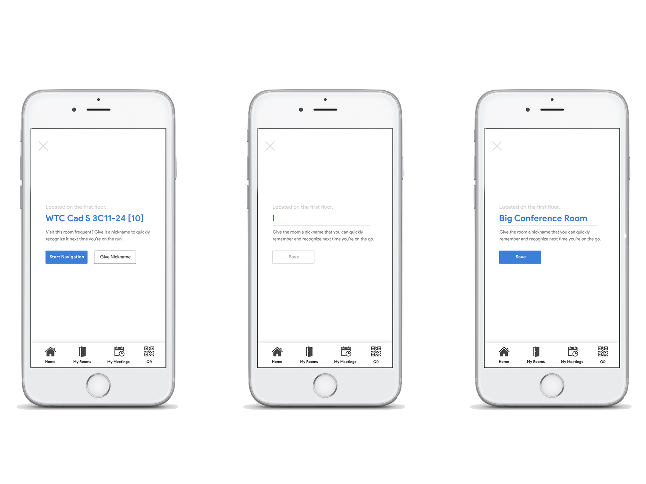
To improve familiarity within the app, I introduced a personalization feature that allowed employees to assign custom nicknames to conference or meeting rooms. During the observation phase, we discovered that employees often remembered rooms by distinct details or unique objects within them. This insight led me to incorporate a feature that organized room information in a way that was both intuitive and personal, enhancing the overall user experience.
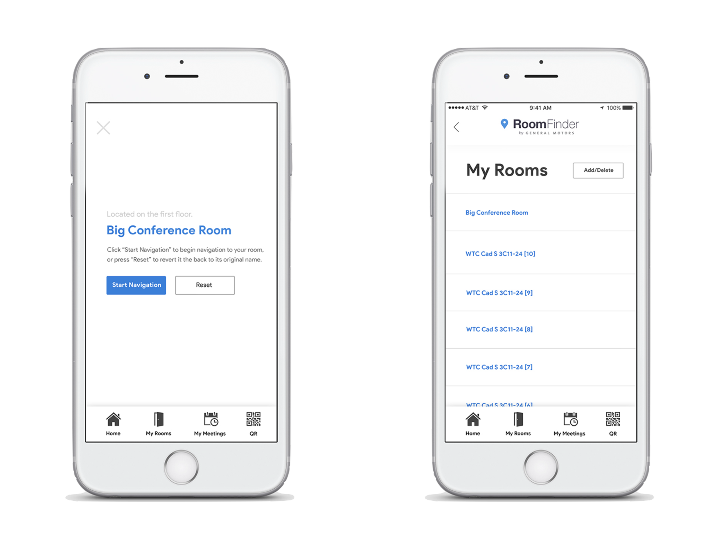
After a user saved a personalized room name, they would be able to either immediately start navigation to that room, or “Reset’ the room name back to it’s conventional building title name.
QR Codes
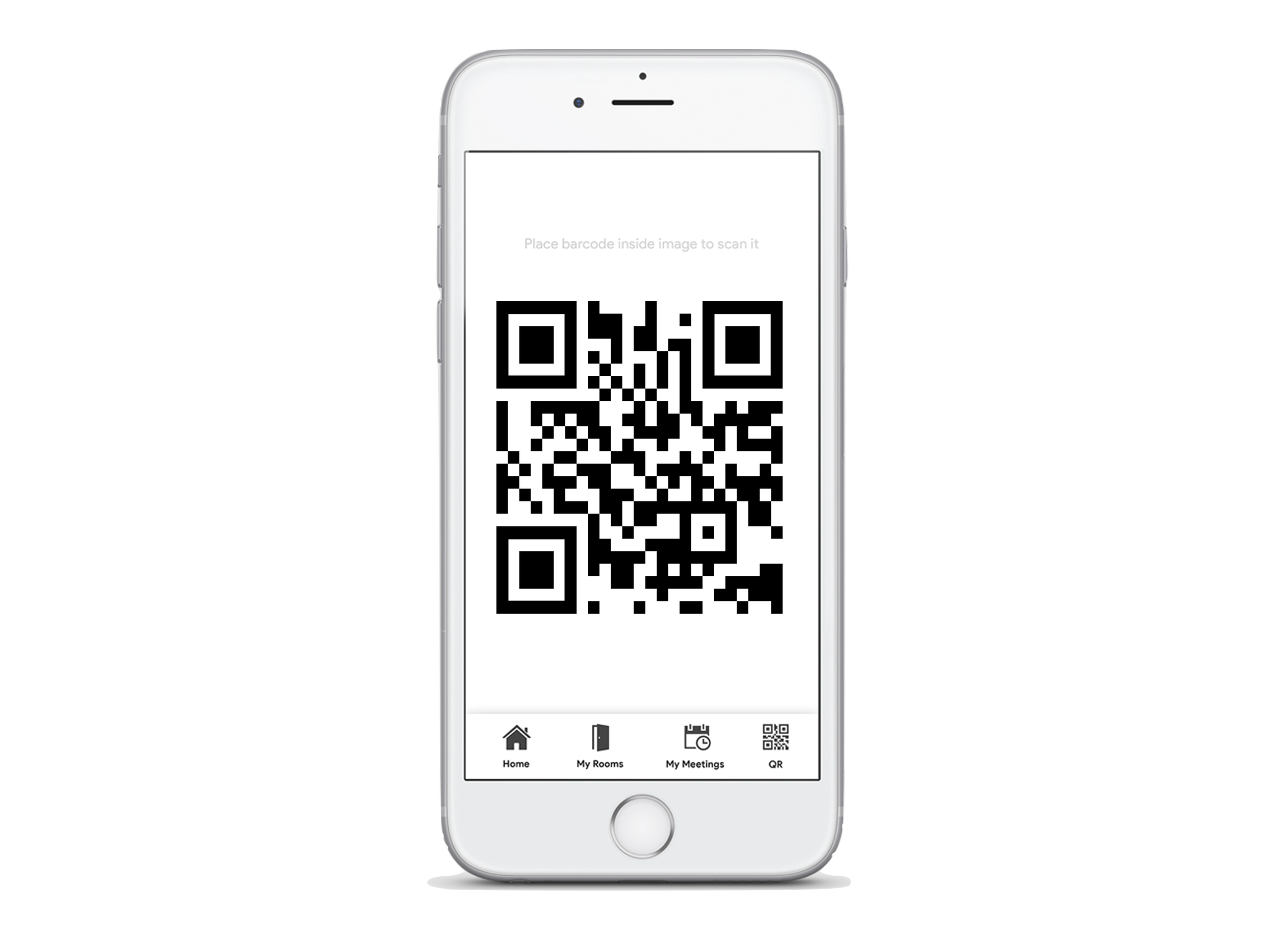
During the observation phase, we uncovered a minor detail that had previously been overlooked by both our team and the research participants: every room on each campus was equipped with a QR code. Recognizing this as an opportunity to enhance the app, I proposed adding functionality that allowed users to scan these QR codes to automatically save room information to their personalized list of saved rooms. After collaborating with our engineering partners, we confirmed that this feature was feasible and could be seamlessly integrated into the application.
Demo-day – App walkthrough.
For our demo day, I created a brief video that served as a high-level trailer of our application.
Outcomes.
Streamlined the process of locating meeting rooms, saving employees valuable time.
Enhanced user satisfaction through intuitive design and personalized features.
Demonstrated the impact of user-centered design in addressing everyday workplace challenges.
Reflections.
This project underscored the importance of combining user research with technical feasibility. By focusing on real employee needs and collaborating closely with engineering, we delivered a practical solution that improved daily workflows.
Project type:
Internal Innovation Challenge